The lost art of good menu design
“What do you think of the new menu?” the manager at my local pub asked me the other night, leaning over the bar with an expectant smile. They’d recently changed chefs, and there was a distinct buzz in the air.
I paused, trying to find a polite way to phrase it. “The food is good,” I replied, “but the menu is terrible. The font is too small, and I can’t read the text against that background.”
Look, I’ll be the first to admit that my eyesight is not as good as it used to be. But I am surely not the only one disadvantaged by this phenomenon.
It’s a scene that’s becoming far too familiar for diners of all ages. Lately, it feels like countless venues have adopted a bizarre trend of tiny, illegible text slapped onto heavily coloured or textured backgrounds. Whether it’s white text on a pastel peach card or charcoal font on dark kraft paper, it’s a design choice that prioritises a vague “vibe” over basic functionality. You shouldn’t need perfect 20/20 vision and a headlamp just to order a chicken parma.
My working theory? Venues probably no longer hire professional graphic designers. Instead, it looks like younger staff members are mocking these layouts up themselves using Canva. Don’t get me wrong, Canva is a brilliant tool, but it doesn’t automatically grant an eye for core typographical principles like hierarchy or contrast ratios. The result is a flood of menus that look pretty on a desktop screen but fail miserably in the dim, ambient lighting of a busy dining room.
Looking through the menus I’ve had to photograph lately, the design errors are glaring.
A Total Lack of Contrast and Grid Structure
The worst offenders ignore basic readability. One cocktail menu I encountered used thin white text against a light orange background—virtually invisible in a dimly lit bar. Another printed dark text on dark, textured brown paper, meaning the background grain actively competed with the words.
Floating Prices and Wall-to-Wall Text
Then there’s the layout chaos. I’ve seen breakfast menus where the alignment is completely erratic; some prices are glued to the dish title while others float mid-page or drift to the far right with massive gaps of dead space. Without dot leaders to connect them, your eyes have to do extra work to track what a meal actually costs.
Even worse, description text is often squeezed together with terrible line spacing. Ingredients blur into a solid, unindented wall of lowercase text, while dense columns of numbers and confusing dietary acronyms like LDO and VGO clog up the margins. Instead of guiding the diner, it creates immediate visual fatigue.
There Is a Better Way
Then there is the other modern dining scourge that completely drives me crazy: the QR code menu that forces you onto a web app. Inevitably, the app isn’t scrollable, it lags, or it demands your email address before you can even look at a drink list. I was recently up in Darwin and faced this exact digital roadblock. When I asked the waiter for a proper, physical menu, I pointed out just how frustrating the interface was. A menu shouldn’t feel like a data-harvesting exercise.
Ironically, the one place that seems to have cracked the code on modern tech integration is Thai Tha Pong down in Newtown. They utilise digital menus on tablets right at the table, but they actually understand user experience. If you can’t read the ingredients, you can simply pinch and zoom to enlarge the text. It’s practical, accessible, and elegantly simple.
In the meantime, the rest of the hospitality industry seems lagging behind. Because of this epidemic of poor design, my phone’s camera roll is no longer full of scenic holiday snaps. Instead, it’s completely filled with hastily taken photographs of menus that I’ve had to snap just so I can zoom in and figure out what on earth I’m actually ordering.
Restaurateurs, please: check your contrast, bump up your font sizes, and test your layouts in low light. Good food deserves to be read by everyone.
Ironically your blog also lacks contrast and is not easy to read for those of us with low vision.
As soon as I posted, I wondered the same thing!! I’ll see what I can do to fix it up.
Hi Fiona, I asked the AI God what theme would be better to use as a primary source for my podcast and to improve accessibility. I would appreciate your feedback about whether this new look is better.
Re your blog, while I don’t really like white backgrounds, I don’t have a problem reading yours at all.
Restaurant manages need to note, if a phones come out for torchlight or a camera for a menu, they need to have a good look at their menus for readability, at the very least.
Years ago at a quite nice but dimly-lit restaurant in Amsterdam, I was impressed that they provided el cheapo reading glasses to assist with reading the bill (and, I guess, the menu).
Brilliant.
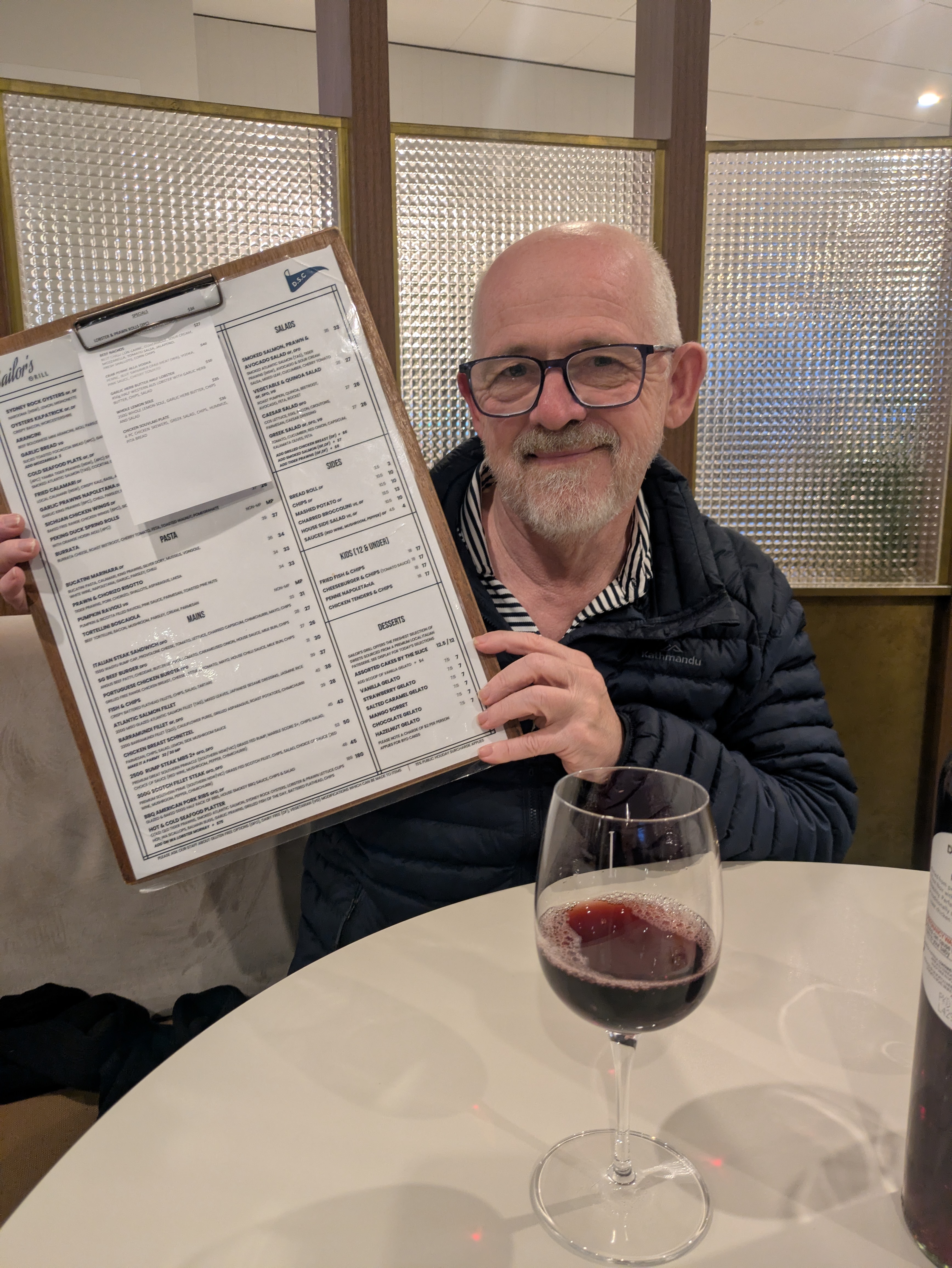
An important update. Last night, friends and I went to the Drummoyne Sailing Club in Sydney and were pleasantly surprised. The patrons were an older crowd, and our table neighbours also appreciated the text. We compliment and thanked the woman running the bistro!!